How can a landing page refresh double conversions?

Challenge
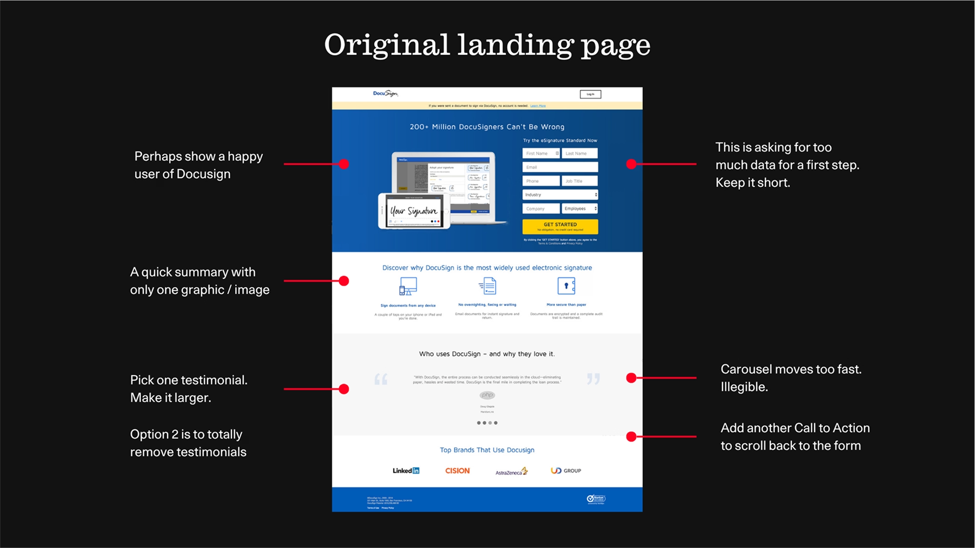
DocuSign’s free trial landing page attracted plenty of traffic, but it wasn’t converting. The page was overloaded with information, relied on outdated design elements, and demanded too much from users too soon.
For audiences in APAC, where expectations around localisation, clarity and mobile experience are high, the existing experience fell short. DocuSign needed a refreshed landing page that not only aligned with its brand but also converted interest into action, quickly, clearly and effectively.
Our Approach
We combined behavioural insight, UX/UI best practices and sharp creative execution to design a landing page that worked harder for the user and the brand.
Auditing the existing page
- We began with a thorough audit of the existing page, analysing user flow, content hierarchy and performance data, to identify the friction points costing conversions.
- We then mapped out a new page strategy anchored in simplicity, credibility and ease of use.
Removing friction and streamlining the journey
- Good UX is invisible. We rebuilt the user experience to feel seamless, intuitive and fast. Every design decision supported a clearer, more confident path to sign up.
- Key UX improvements included:
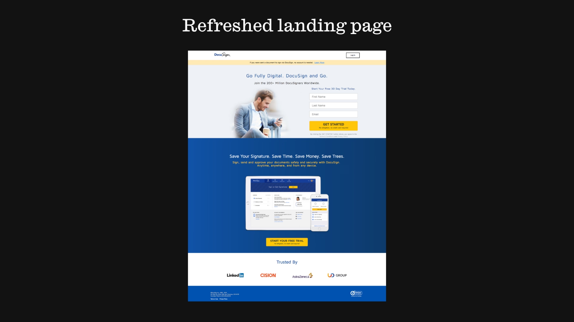
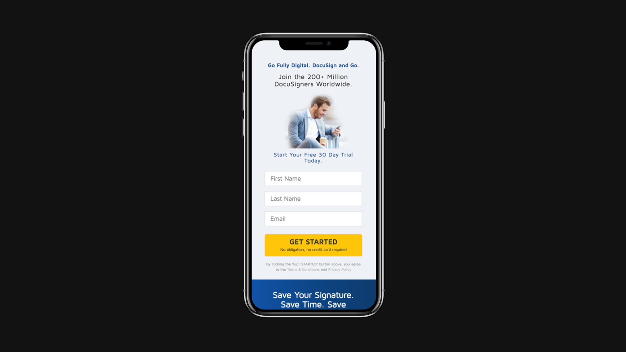
- Cut down the number of form fields to just the essentials—name and email—to reduce drop-offs.
- Rewrote copy to focus on benefits, not just features, and tailored it to local markets.
- Improved responsiveness to ensure the experience translated seamlessly to mobile devices, where most users engage.
- Reordered page hierarchy, placing the CTA above the fold, followed by scannable content chunks that built momentum.
- Prioritised information that reduced hesitation—value proposition first, proof points next.
Elevating the look and feel
- A visually engaging interface is the first signal of trust and professionalism. We simplified and modernised the page design to create a more polished, human and credible experience.
- Key UI changes included:
- Simplified layout to guide the eye and reduce visual clutter.
- Stronger headline and CTA pairing for immediate clarity and action.
- Contextual imagery showing real people using DocuSign, making the product feel relevant and tangible.
- Elevated brand colours and typography for consistency across touchpoints.
- Visible, static testimonials that worked as social proof—no more fast-scrolling carousels.
By reducing friction, focusing on clarity, and designing with the user in mind, the refreshed page dramatically improved performance.
Key outcomes included:
A 2x increase in sign-up conversion rate
A simplified user journey that reduced abandonment
An elevated brand experience that felt modern, localised and mobile-first